Bringing clarity to a member’s healthcare experience.
A native member experience must make dense information navigable, feel familiar on the device and stay coherent with related product surfaces.
- My contribution
- Main designer for the presented work, working with UX, business analysis, QA and development.
- Design focus
- Native member UI, shared patterns and cross-platform consistency.
- Evidence
- Coverage and update-notice exports, plus the supplied collaboration narrative.
Product context
One member, several surfaces.
The supplied project narrative describes native member experiences alongside a web portal and related products. The design problem was to keep navigation and interface patterns coherent without assuming that every platform should behave identically.
A member looking for coverage needs an understandable path through information that has its own categories and rules. Consistency helps when the same concept appears again. Native conventions help when the person needs to navigate, open a detail or return to where they were.
Coverage navigation
Keep the category and the context visible.
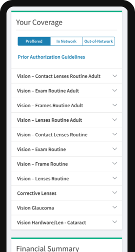
The coverage export shows network categories at the top, a link to prior authorization guidelines and a series of expandable benefit rows. The structure separates the category being considered from the individual benefit someone wants to inspect.
That separation is useful for dense information: the member can identify a benefit before opening it, while the network context stays nearby. The export also shows the start of a Financial Summary section. It does not show every expanded value, so this case does not invent benefit terms or coverage amounts.
The review question is whether context survives a change of category or a return from detail. A selected tab should be explicit, benefit labels should stay readable, and different states should not depend on color alone. These are interface-review criteria, not a measured usability result.
Two member-facing states.
Cross-platform craft
Shared language, native behavior.
A shared UI kit helps related experiences recognize the same components, naming and hierarchy. It should not force a web interaction into a native app simply because the visual shape can be reused. The relationship between a pattern and its behavior is part of the design work.
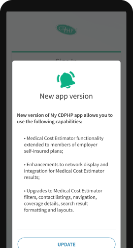
For a benefit row, that means considering its label, expansion indicator, selected context and return behavior together. For a notice, it means making its purpose and action legible without confusing it with the underlying member content. Shared patterns need explicit states as well as a default appearance.
The source reports shared UI and cross-platform work. Exact platform coverage and released component versions remain review items; no complete system inventory is inferred from these two images.
Collaboration and delivery
Connect requirements to the interface.
The supplied narrative describes collaboration with UX, business analysis, QA and developers. Links between tasks, requirements and design, alongside current UI documentation, helped keep discussion anchored in the intended behavior.
Business analysis brings rules and edge cases into focus. QA can challenge whether a state is defined and recoverable. Developers surface platform and implementation constraints. The designer’s role is to turn that discussion into a coherent interface, with clear decisions rather than an isolated set of polished screens.
My responsibility was the design work within the scope presented here. This case describes the collaboration approach and supplied artifacts; it does not assign a quantified delivery-speed improvement or an official role title that has not been confirmed.
A careful conclusion
Coherence is a practical design outcome.
The presented work connects understandable member information with shared interface patterns and cross-functional implementation discussion. The coverage image makes the hierarchy tangible; the notice shows another type of state the native experience must communicate.
Scope and evidence limits
The source contains conflicting descriptions of provider-cost navigation and insurance-plan comparison. This prototype excludes the unverified plan-comparison redesign. It also does not infer appointment booking, claims submission, performance figures or all shipped features from the exports. Dates, releases and measured outcomes await review.